The monthly temperature trends and rainfall recorded by the on-site weather station for February are shown in Figure 1. Total rainfall was 2.3 inches.
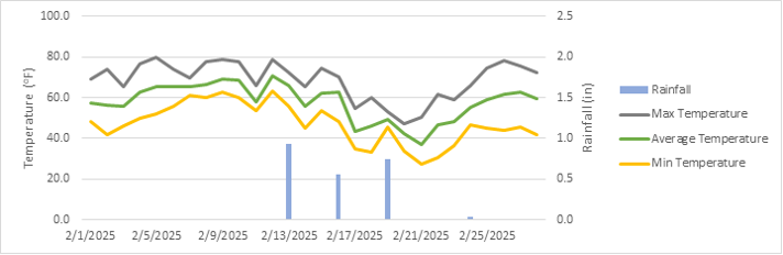
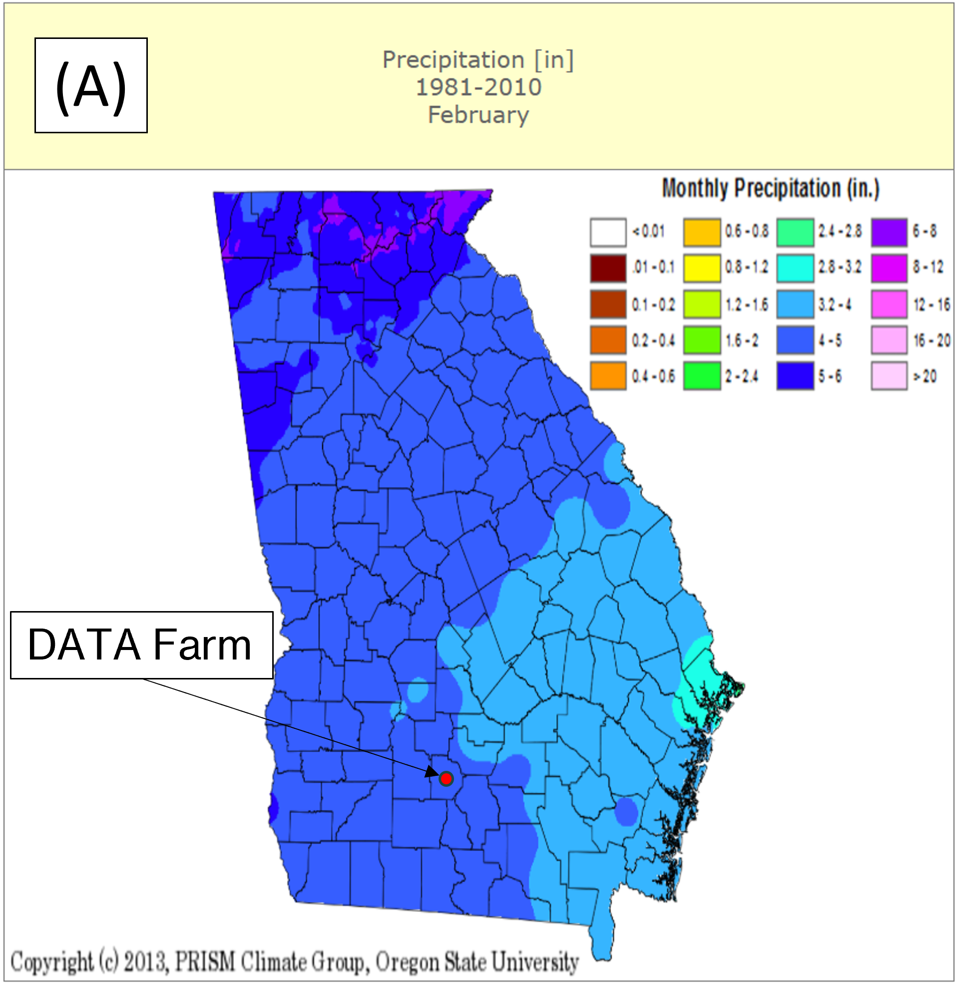
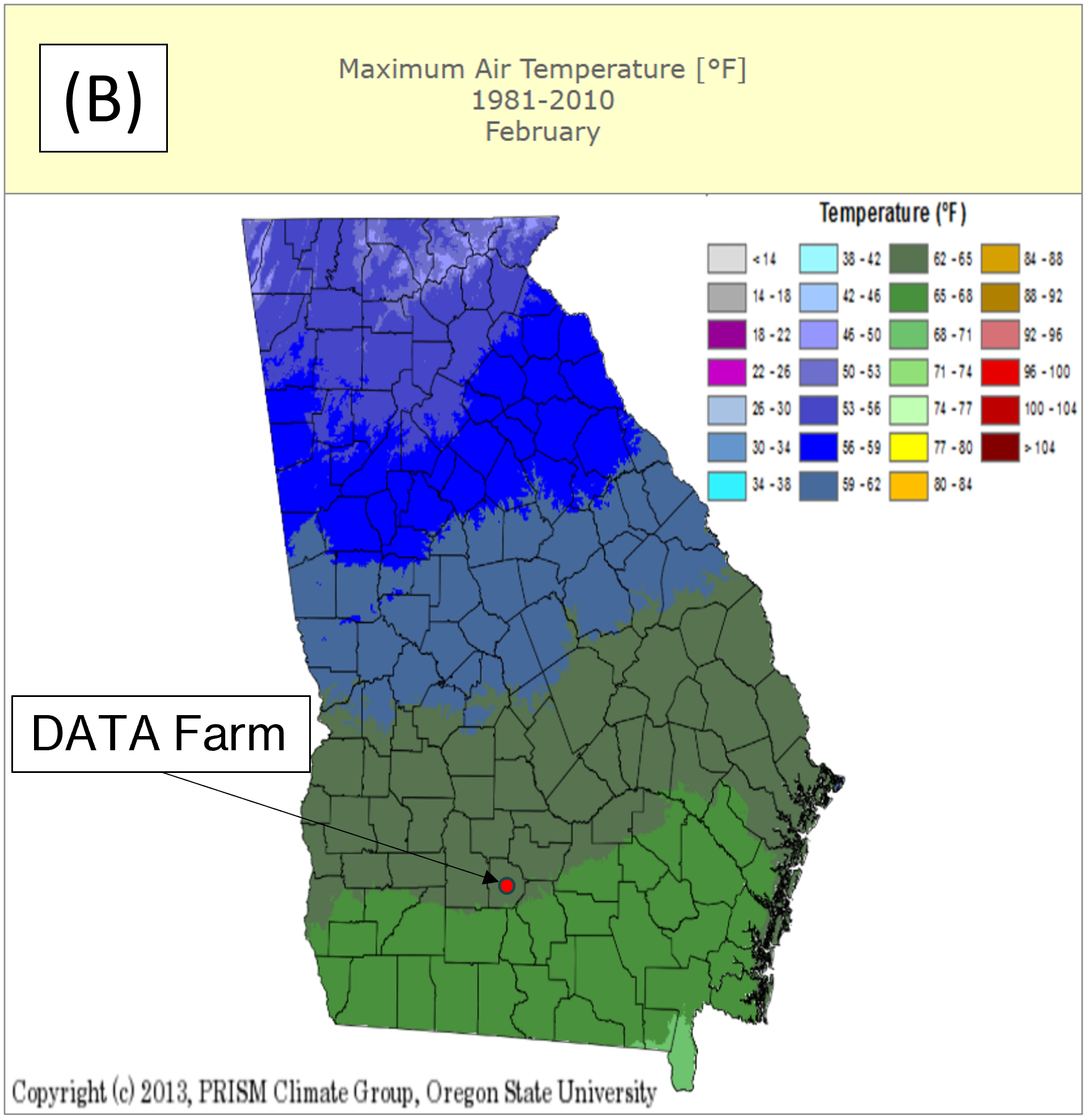
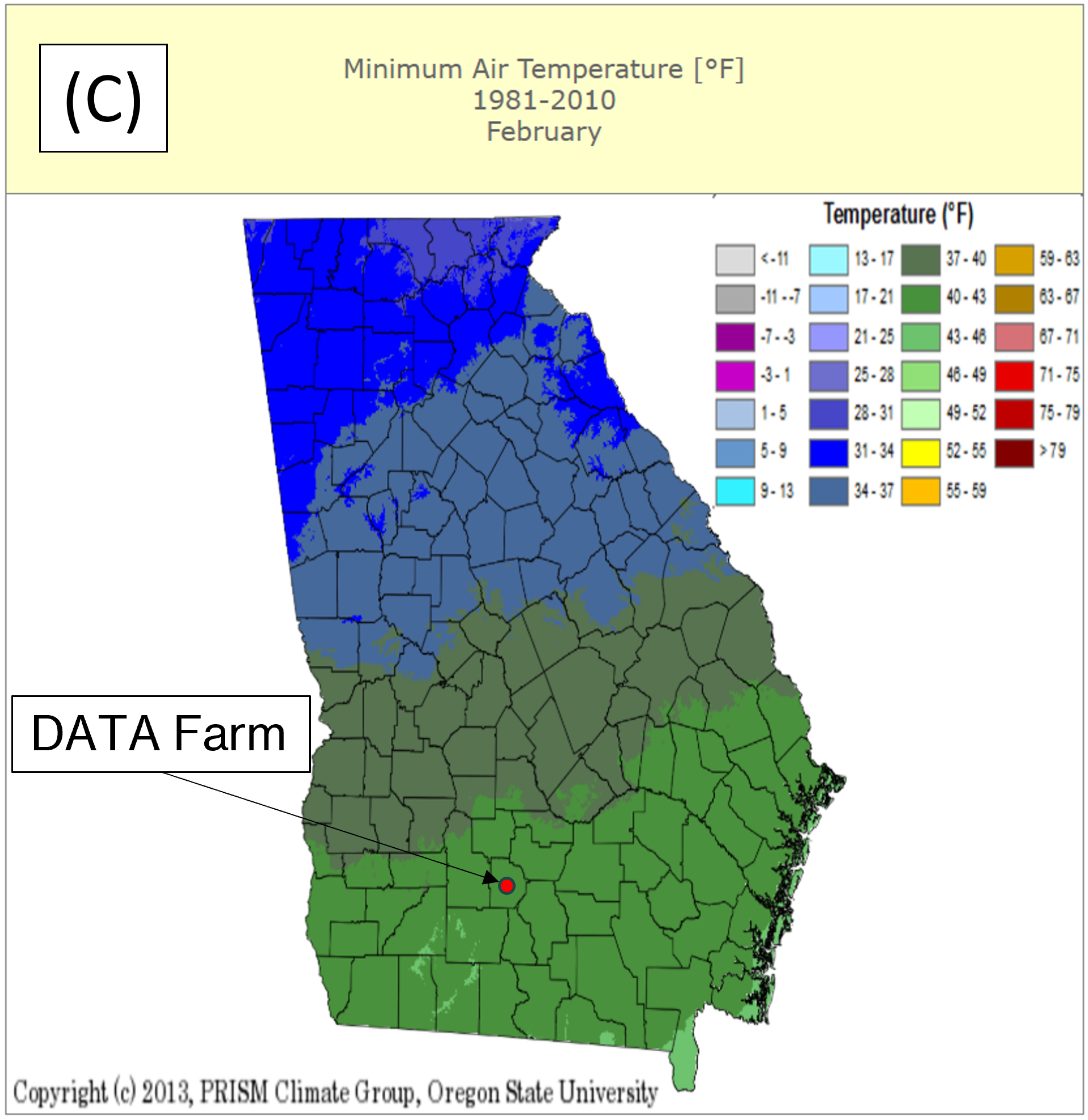
For comparison, Georgia climate maps based on data from 1981 to 2010 (UGA’s Weather Network) are shown in Figure 2 for the month of February. The DATA Farm is in the zone showing 4 to 5 inches of precipitation (Figure 2A), indicating that the measured 2.3 inches was drier than average. The average maximum (Figure 2B) and minimum (Figure 2C) historical temperature ranges are 62°F to 65°F and 40°F to 43°F, respectively. With an average maximum temperature of 69°F at the DATA Farm, an above-average maximum temperature was observed. The observed average minimum temperature was 47°F, also above the average range for historical minimum temperature. These above average deviations in weather show warmer than average weather in February.
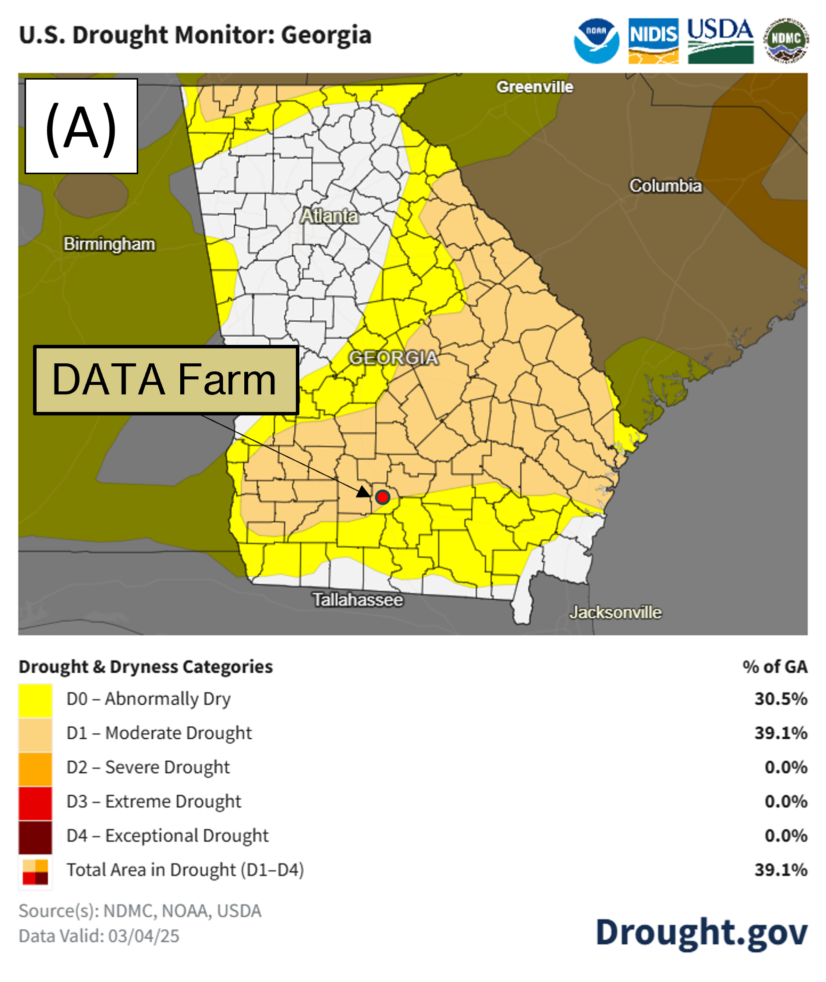
The below average rainfall for the past 4 months has led to Abnormally Dry (D0) and Moderate Drought (D1) conditions in Georgia. Figure 3A shows the current drought monitor map from the National Integrated Drought Information System for Georgia. Abnormally Dry conditions are present in 30.5% of the state and moderate drought conditions are present in 39.1% of the state. Figure 3B shows drought conditions for Tift County where the 4D Farm is located. The county is split into both abnormally dry (33.2%) and moderate drought (66.8%) and the 4D Farm is located in the moderate drought area.
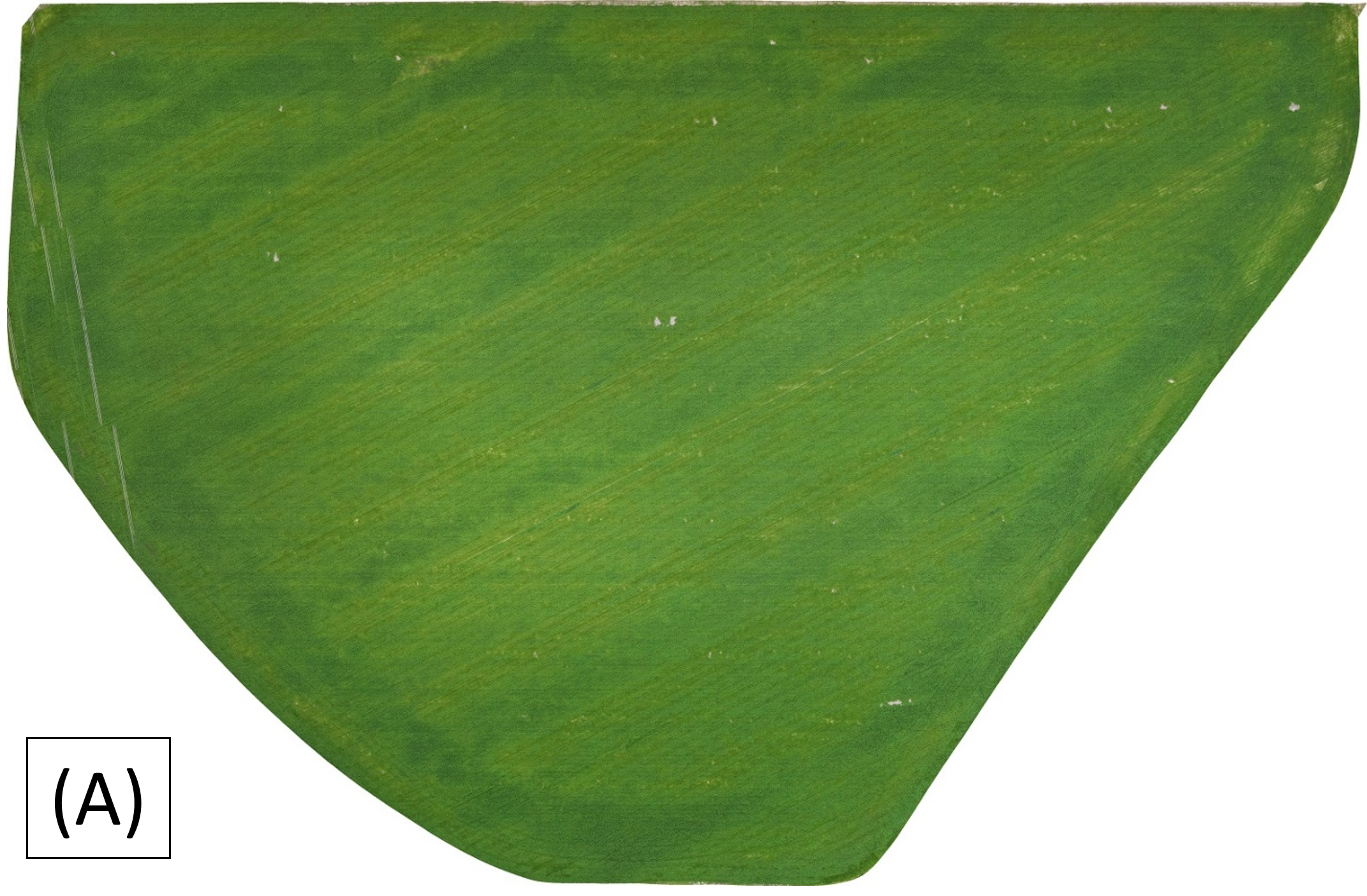
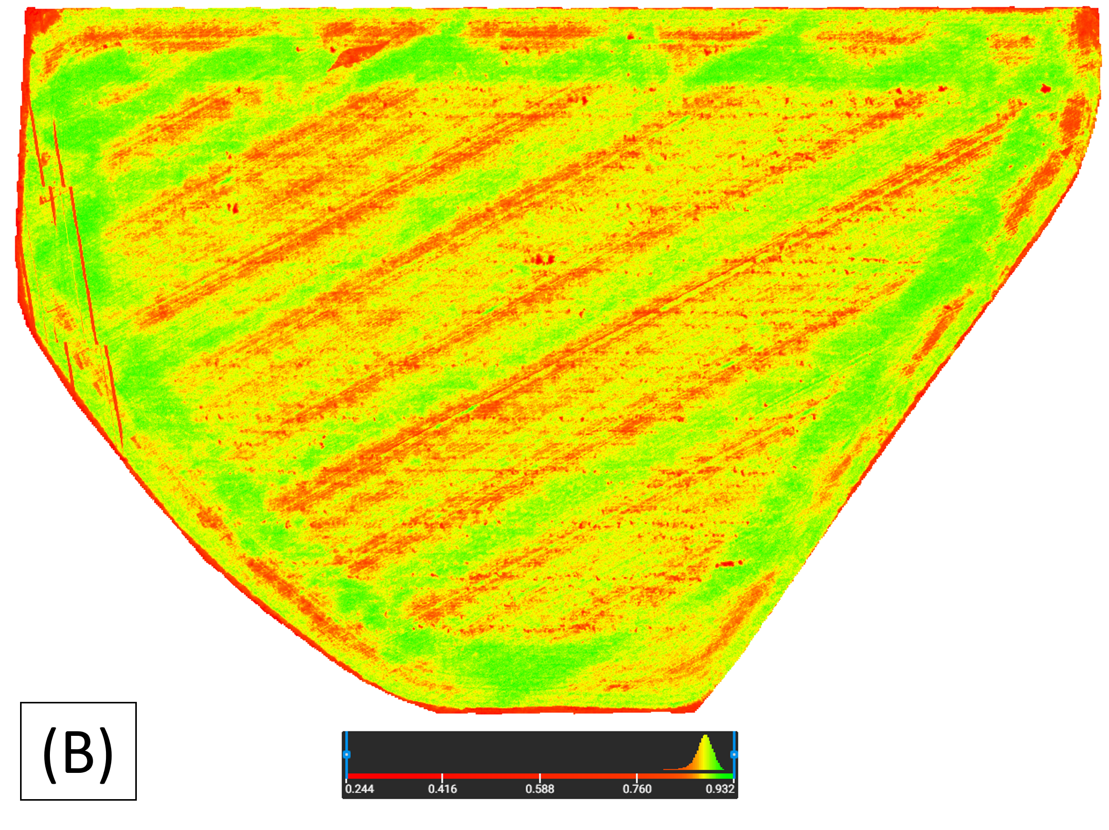
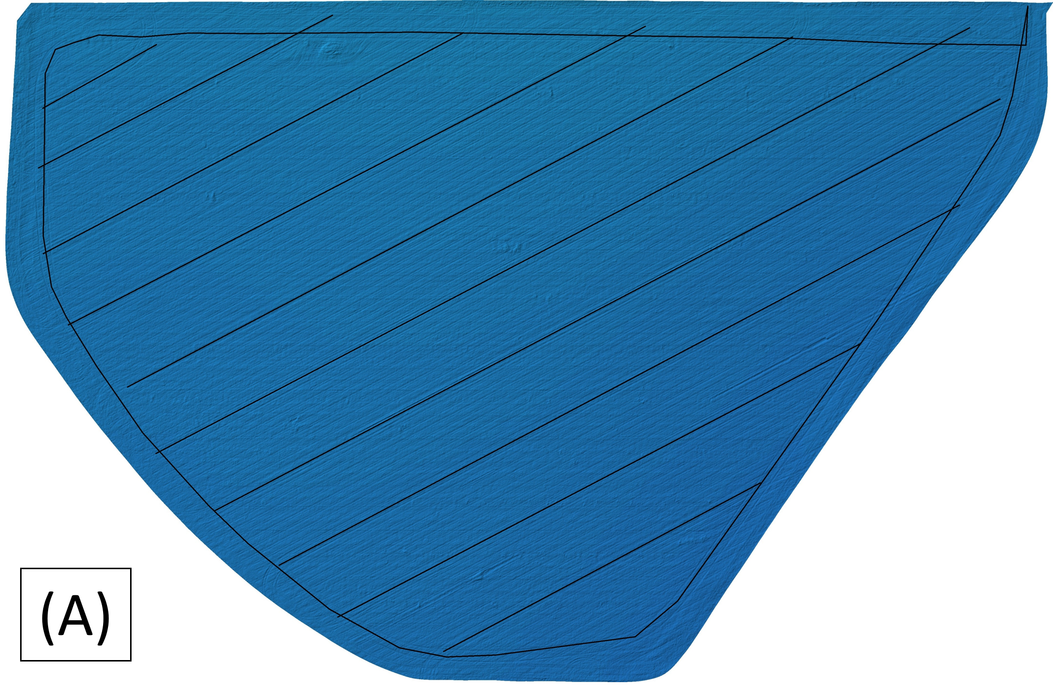
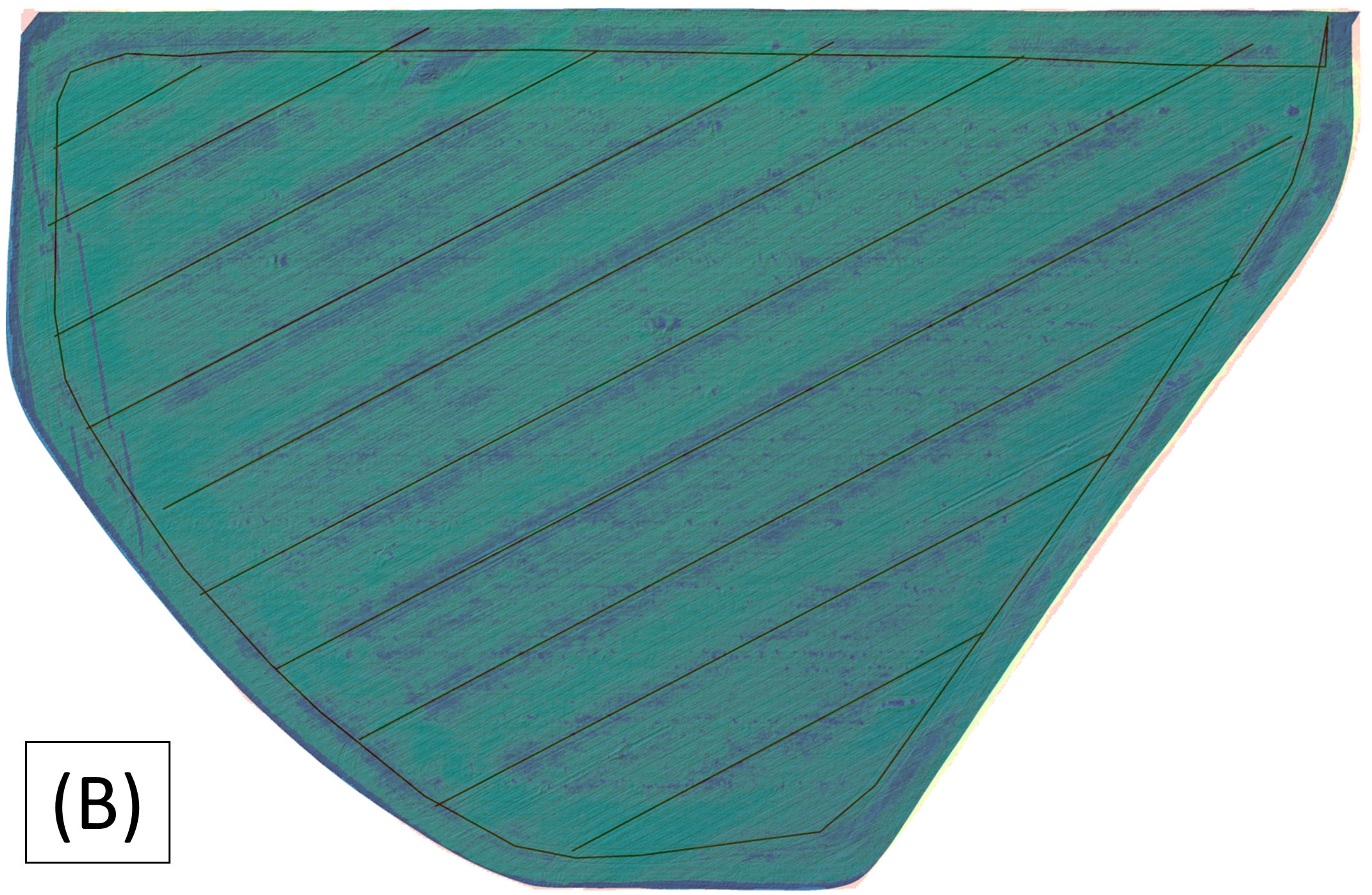
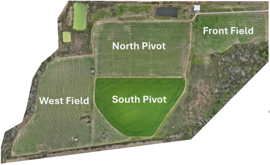
The ryegrass in South Pivot is shown in Figure 4 from a drone flight on 3/3/25. Figure 4A is an RGB image of the field, and Figure 4B is a Normalized Difference Vegetation Index (NDVI) image of the field. NDVI is used here to estimate crop biomass, with green areas having more and red areas having less or none (bare soil). When looking at the NDVI image, a distinct pattern is noticeable around the perimeter and diagonally across the field. The only operation in the field since planting was the application of nitrogen in January. When the operation was performed, we contacted the dealer to get the as-applied map. Unfortunately, it was not available because a common workflow is to clear the operation from the monitor when they leave the field. The project team discussed potential causes of the green streaks and reviewed UAV maps following the application to determine the route of the spreader. A digital elevation model (DEM) showed the tracks of the applicator, so lines were drawn to show the route of the applicator across the field (Figure 5A). Next, we overlayed the NDVI image on the DEM to see if the tracks matched any visible patterns (Figure 5B). From this multilayer image, we determined the spreader was not correctly calibrated, which resulted in an uneven pattern. The spread pattern appears to apply more product on one side than the other. This was compounded when turning around and making a pass back in the other direction with the side that is putting out more product overlapping the same area it had just overapplied. This demonstrates the importance of proper spreader calibration for even product application to achieve consistent growth.
ABAC plans to cut the ryegrass in mid-March, depending on weather conditions, then bale the ryegrass. After the ryegrass is baled it will be wrapped for storage and fed to the ABAC cattle herd.
Operations:
Subscribe to get the latest posts sent to your email.